| Most people look back at the dot-com bubble and acknowledge valuations were elevated far above historical norms. Investors ignored historically useful fundamentals like earnings and book value and started to rely on new measures like eyeballs and clicks. They really started to believe “This time it’s different” (the four most dangerous words in investing according to Sir John Templeton). With the benefit of hindsight, most have come to acknowledge these real dollar fundamentals and valuations ultimately drive returns – not clicks or hope.
In the case of the credit crisis, we find many investors, investment professionals, and the general media attribute the market collapse almost entirely to the shenanigans in the financial sector and related consequences in the real economy. What appears to get lost is the fact that valuations outside of the financial sector were once again elevated far above the fundamentals. This brief article revisits the credit crisis and subsequent market decline. We contend that the financial crisis that reverberated throughout the global economy was not necessarily the primary driver of the market’s approximately 50% collapse. Instead, we believe it was more of a catalyst for the true 800 pound gorilla facing markets at the time: overvaluation. Our perspective has direct implications for investors today as we find valuations once again significantly elevated. Indeed, several years of quantitative easing (QE) has elevated prices and valuations in virtually all asset classes. We do not know what the catalyst will be this time around (China, Brexit, US politics, geopolitical issues, etc) or what will happen over the short term, but we find both stocks and bonds are priced for dismal returns over longer periods. |
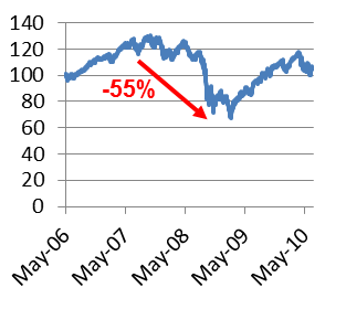
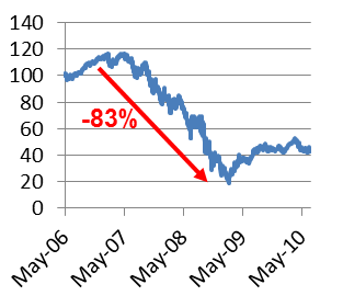
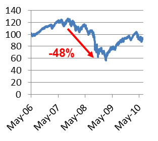
Figure 1: Peak to Trough Stock Performance during the Credit Crisis
| Broad market (S&P 500)
|
Financials
|
Non-Financials
|
Source: Aaron Brask Capital, Bloomberg
In a Nutshell
US stock markets fell roughly 50% during the credit crisis. However, the financial sector comprised just 22% of the overall index[1] going into the crisis. Even if all of these financial services companies completely evaporated (i.e., there stock went to zero), this would only amount to a 22% decline. What accounts for the rest of the 50% decline? Clearly the rest of the market (i.e., non-financial services) must have declined as well.
Some might just assume the rest of the market declined 28% so that the total decline was 50% (22% financials + 28% non-financials). However, there is a flaw in this math and the real result is even worse. For simplicity, let’s assume the market was an even $100 before the collapse – $22 of this in financial stocks and $78 in non-financials. If financials went to zero, only $78 of non-financials were left. However, we know the market eventually lost 50% so this $78 must have declined to $50. In particular, the non-financials must have fallen 36% ($50 ÷ $78 – 1).
These back-of-the-envelope estimates relied on some assumption and approximations (e.g., the financial stocks all went to zero). The next section looks up the actual figures and calculates the declines more precisely.
More Precise Math
For more precise calculations, we can look at the performance of the S&P 500 broad market index, S&P 500 financials index, and S&P 500 ex-financials index individually. Each of these indices declined substantially during the credit crisis. However, the peaks and troughs for each did not necessarily occur at the same times.
Figure 2: Credit Crisis Peaks, Troughs, and Declines
Source: Aaron Brask Capital |
While there was an 83% decline in financial services, the key figure we highlight here is the 48% in the rest of the index. These are total return figures including dividends; the loss in the rest of the index (non-financials) would have been over 50% without dividends.
Why Does This Matter?
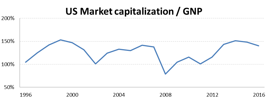
The above figures clearly indicate the overall market decline was not just due to the collapse of the financial sector. The rest of the index (non-financials) declined by roughly 50%. Our view is that while the turmoil in the financial sector certainly provided a catalyst for risk aversion, the bulk of the market decline was due to high valuations going into the crisis. The first chart below shows a 20-year history of valuations. Note how high valuations occurred just before both the bursting of the tech bubble and credit crisis.
| The Buffett Indicator
In an interview with Forbes magazine, Warren Buffett once suggested the ratio of market capitalization to GNP was “the best single measure of where valuations stand at any given moment”. This metric has often been called the Buffett Indicator. In a nutshell, one can interpret GNP as aggregate sales. This figure goes up over time although some business cycles add some volatility to the trend. Then a portion of these sales will be profit. To be precise, profits are equal to sales multiplied times profit margins. These profit margins tend to be mean reverting over time. Lastly, the market places a valuation on these (and future) profits and the result is a market price. Adding up market prices for all shares one arrives at market capitalization. While there are multiple moving parts here that get from GNP to market capitalization, the Buffett indicator skips the intermediate and just looks at that ratio (i.e., market capitalization divided by GNP). Our and others’ research indicates this particular measure has the best correlation with subsequent 10-year market returns. The historical correlation is approximately 90%. In other words, valuation matters. Notwithstanding, anything can happen in the short term as periods of over- and under-valuation often persist for multiple years. |
Figure 3: History of US Market Valuations (Buffett Indicator)
Source: Aaron Brask Capital, The World Bank
While the above chart appears to indicate valuations are as lofty as they were during the tech bubble and pre-credit crisis periods, the chart below (borrowed from a previous article More Market Correction to Come) uses another simpler valuation metric (price divided by sales). This valuation metric looks almost identical to the above chart with peaks just before the major market declines.
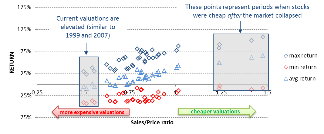
To illustrate the importance of valuations, we present this another way. The chart below displays the maximum, average, and minimum absolute returns of the S&P 500 price index over 10-year periods (vertical or y-axis) relative to the level of valuations at the beginning of each period (horizontal or x-axis). A higher sales/price ratio to the right indicates cheaper and more attractive valuations while a lower ratio indicate more expensive valuations. The key observation here is that each return metric (maximum, average, and minimum) trends higher from left to right indicating more (less) attractive valuations are conducive to higher (lower) returns.
Figure 4: Market Valuations (Sales ÷ Price) versus Subsequent Performance
Source: Aaron Brask Capital, Bloomberg
The most important takeaway from this chart is the shaded box. Note that each time valuations reached these (expensive) levels, the red markers indicate significant declines always occurred in the ensuing period.
Conclusions
We find the standard summary of the credit crisis we come across ascribes the market decline to the financial crisis. We do not believe this is the case. We believe the major driver of this particular decline was overvaluation and the financial crisis served as a catalyst for investors become risk averse. Because of the lofty valuations, value investors did not enter the market and create a floor until prices fell significantly and valuations became more attractive.
This is very relevant today. While investors generally accept low interest rates and yields will result in lower returns going forward, we suspect many still fail to see the same cause and effect for stocks. High valuations are conducive to lower returns for all assets.
In our view, investors have become fixated on the Fed – believing they have the power to support markets no matter what comes their way. For several years now bad (economic) news has been good news for stock markets as investors anticipated more stimulus and QE. However, good news was good too! In reality, you cannot have your cake and eat it too. Fundamentals ultimately win. Unfortunately they are currently hovering far below market prices and the Fed fewer options this time around with interest rates already low.
Note: Timing markets and making sensible portfolio adjustments is a significant challenge. For example, there can be significant tax consequences (i.e., capital gains) and transaction costs. Moreover, investors’ behavioral psychology can make it very painful watching bubbles continue to grow from the sidelines. Investors and their advisors should consider these and other factors before advocating any changes to portfolio allocations.
About Aaron Brask CapitalMany financial companies make the claim, but our firm is truly different – both in structure and spirit. We are structured as an independent, fee-only registered investment advisor. That means we do not promote any particular products and cannot receive commissions from third parties. In addition to holding us to a fiduciary standard, this structure further removes monetary conflicts of interests and aligns our interests with those of our clients. In terms of spirit, Aaron Brask Capital embodies the ethics, discipline, and expertise of its founder, Aaron Brask. In particular, his analytical background and experience working with some of the most affluent families around the globe have been critical in helping him formulate investment strategies that deliver performance and comfort to his clients. We continually strive to demonstrate our loyalty and value to our clients so they know their financial affairs are being handled with the care and expertise they deserve. |
Disclaimer
|
- We use the S&P 500 index as a proxy for the broad stock market. ↑

